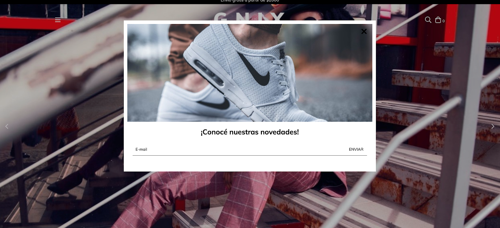
En el este tutorial vamos a agregar un popup que aparece en la página de inicio con la posibilidad de mostrar:
- Una imagen
- Un texto
- Un link tanto para la imagen como el texto
- El formulario de subscripción al newsletter
HTML
Lo primero que vamos a hacer es crear las carpeta home y forms dentro de la carpeta snipplets.
1. Dentro de la carpeta home, agregamos el snipplet home-popup.tpl con el siguiente código:
{% embed "snipplets/modal.tpl" with{modal_id: 'home-modal', modal_position: 'bottom', modal_transition: 'slide', modal_header: false, modal_footer: false, modal_width: 'centered', modal_class: 'centered-small', modal_close_class: 'invert mt-2 mr-3'  } %}

    {% block modal_body %}
        {% if "home_popup_image.jpg" | has_custom_image %}
            {% if settings.home_popup_url %}
            <a href="{{ settings.home_popup_url }}">
            {% endif %}
                <div class="lazyload fade-in modal-img-full img-responsive" data-bg='{{ "home_popup_image.jpg" | static_url | settings_image_url }}' style="background-image: url({{ 'home_popup_image.jpg' | static_url | settings_image_url('thumb') }});"></div>
            {% if settings.home_popup_url %}
            </a>
            {% endif %}
        {% endif %}

        {% if settings.home_popup_txt or settings.home_news_box %}
        <div class="align-items-center {% if not 'home_popup_image.jpg' | has_custom_image %}mt-3{% endif %}">
            {% if settings.home_popup_txt %}
                <div class="col-12">
                    {% if settings.home_popup_url %}
                    <a href="{{ settings.home_popup_url }}">
                    {% endif %}
                    <h3 class="text-center mt-3 {% if not settings.home_news_box %}mb-0{% endif %}">{{ settings.home_popup_txt }}</h3>
                    {% if settings.home_popup_url %}
                    </a>
                    {% endif %}
                </div>
            {% endif %}

            {% if settings.home_news_box %}
                <div class="col-12 newsletter">
                    <div id="news-popup-form-container">
                        <form id="news-popup-form" method="post" action="/winnie-pooh" class="js-news-form">
                            <div class="input-append">

                                {% embed "snipplets/forms/form-input.tpl" with{input_for: 'email', type_email: true, input_name: 'email', input_id: 'email', input_placeholder: 'Email' | translate, input_aria_label: 'Email' | translate } %}
                                {% endembed %}

                                <div class="winnie-pooh" style="display: none;">
                                    <label for="winnie-pooh-newsletter">{{ "No completar este campo" | translate }}</label>
                                    <input id="winnie-pooh-newsletter" type="text" name="winnie-pooh"/>
                                </div>
                                <input type="hidden" name="name" value="{{ "Sin nombre" | translate }}" />
                                <input type="hidden" name="message" value="{{ "Pedido de inscripción a newsletter" | translate }}" />
                                <input type="hidden" name="type" value="newsletter" />
                                <div class="js-news-spinner text-center" style="display: none;">
                                    {% include "snipplets/svg/sync-alt.tpl" with {svg_custom_class: "icon-inline svg-icon-text icon-spin icon-2x mb-3"} %}
                                </div>
                                <div style='display: none;' class="js-news-popup-success alert alert-success">{{ "¡Gracias por suscribirte! A partir de ahora vas a recibir nuestras novedades en tu email" | translate }}</div>
                                <div style='display: none;'class="js-news-popup-failed alert alert-danger">{{ "Necesitamos tu email para enviarte nuestras novedades." | translate }}</div>
                                <input type="submit" name="contact" class="btn newsletter-btn js-news-send" value='{{ "Enviar" | translate }}'>
                            </div>
                        </form>
                    </div>
                </div>
            {% endif %}
        </div>
        {% endif %}
    {% endblock %}
{% endembed %}
2. En la carpeta forms vamos a agregar el snipplet form-input.tpl que usaremos para el campo de subscripción al newsletter:
{# /*============================================================================
  #Form input
==============================================================================*/

#Properties

#Group
    //input_group_custom_class for custom CSS classes
#Label
    // input_label_id for ID
    // input_for for label for
    // input_label_custom_class for custom CSS classes
    // input_label_text for label text
#Prepend
    // input_prepend_content to add content before input
#Container (Only if has prepend or append)
    // form_control_container_custom_class for container custom class. E.g: col
#Input
    // Can be text_area or input
    // input_type to define type (text, tel, number or passowrd)
    // input_id for id
    // input_name for name
    // input_value for val
    // input_placeholder for placeholder
    // input_custom_class for custom CSS classes
    // input_rows for textarea rows
    // input_data_attr for data attributes
    // input_data_val for input_data_attr value
    // input_aria_label for aria-label attribute
#Append
    // input_append_content to add content after input
#Alerts
    // input_form_alert to insert alerts
#}

<div class="form-group {{ input_group_custom_class }}">
    {% if input_label_text %}
        <label {% if input_label_id %}id="{{ input_label_id }}"{% endif %} class="form-label {{ input_label_custom_class }}" {% if input_for %}for="{{ input_name }}"{% endif %}>{{ input_label_text }}</label>
    {% endif %}
    {% block input_prepend_content %}
    {% endblock input_prepend_content %}
    {% if input_append_content or input_prepend_content %}
    <div class="form-control-container {{ form_control_container_custom_class }}">
    {% endif %}
    {% if text_area %}
        <textarea
            {% if input_id %}id="{{ input_id }}"{% endif %}
            class="form-control form-control-area {{ input_custom_class }} {% if input_append_content %}form-control-inline{% endif %}"
            autocorrect="off"
            autocapitalize="off"
            {% if input_name %}name="{{ input_name }}"{% endif %}
            {% if input_value %}value="{{ input_value }}"{% endif %}
            {% if input_rows %}rows="{{ input_rows }}"{% endif %}
            {% if input_placeholder %}placeholder="{{ input_placeholder }}"{% endif %}
            {% if input_data_attr %}data-{{ input_data_attr }}="{{ input_data_val }}"{% endif %}></textarea>
    {% else %}
        <input
            type="{% if type_text %}text{% elseif type_number %}number{% elseif type_tel %}tel{% elseif type_password %}password{% elseif type_hidden %}hidden{% endif %}"
            {% if input_id %}id="{{ input_id }}"{% endif %}
            class="form-control {{ input_custom_class }} {% if input_append_content %}form-control-inline{% endif %}"
            autocorrect="off"
            autocapitalize="off"
            {% if type_password %}autocomplete="off"{% endif %}
            {% if input_name %}name="{{ input_name }}"{% endif %}
            {% if input_value %}value="{{ input_value }}"{% endif %}
            {% if input_min %}min="{{ input_min }}"{% endif %}
            {% if input_placeholder %}placeholder="{{ input_placeholder }}"{% endif %}
            {% if input_data_attr %}data-{{ input_data_attr }}="{{ input_data_val }}"{% endif %}
            {% if input_aria_label %}aria-label="{{ input_aria_label }}"{% endif %}/>
    {% endif %}
    {% if input_append_content or input_prepend_content %}
    </div>
    {% endif %}
    {% block input_append_content %}
    {% endblock input_append_content %}
    {% if input_help %}
    <div class="mt-4 text-center">
        <a href="{{ input_help_link }}" class="btn-link {{ input_link_class }}">{% block input_help_text %}{% endblock input_help_text %}</a>
    </div>
    {% endif %}
    {% block input_form_alert %}
    {% endblock input_form_alert %}
</div>
3. Ahora necesitamos crear el snipplet para el componente modal o popup dentro de la carpeta snipplets. Este tpl se llama modal.tpl y el código es:
{# /*============================================================================
  #Modal
==============================================================================*/

#Properties
    // ID
    // Position - Top, Right, Bottom, Left
    // Transition - Slide and Fade
    // Width - Full and Box
    // modal_form_action - For modals that has a form

#Head
    // Block - modal_head
#Body
    // Block - modal_body
#Footer
    // Block - modal_footer

#}

{% set modal_overlay = modal_overlay | default(true) %}


<div id="{{ modal_id }}" class="js-modal modal modal-{{ modal_class }} modal-{{modal_position}} transition-{{modal_transition}} modal-{{modal_width}} transition-soft" style="display: none;">
    {% if modal_form_action %}
    <form action="{{ modal_form_action }}" method="post" class="{{ modal_form_class }}">
    {% endif %}
    {% if modal_header %}
        <div class="js-modal-close modal-header">
            <span class="modal-close {{ modal_close_class }}">
                {% include "snipplets/svg/times.tpl" with {svg_custom_class: "icon-inline svg-icon-text"} %}
            </span>
            {% block modal_head %}{% endblock %}
        </div>
    {% else %}
        <span class="js-modal-close modal-close no-header {{ modal_close_class }}">
            {% include "snipplets/svg/times.tpl" with {svg_custom_class: "icon-inline icon-2x svg-icon-text"} %}
        </span>
    {% endif %}
    <div class="modal-body">
        {% block modal_body %}{% endblock %}
    </div>
    {% if modal_footer %}
        <div class="modal-footer d-md-block">
            {% block modal_foot %}{% endblock %}
        </div>
    {% endif %}
    {% if modal_form_action %}
    </form>
    {% endif %}
</div>
Si ya estabas usando este tpl en tu diseño, probablemente tengas que actualizar los llamados de los embeds donde lo uses y agregar la propiedad modal_header: true.
4. En este tenemos que llamar al snipplet del popup de novedades en el template templates/home.tpl para mostrarlo en la página inicial.
{% if settings.home_promotional_popup %}
    {% include 'snipplets/home/home-popup.tpl' %}
{% endif %}
5. Por último para la parte de HTML, necesitamos agregar una carpeta SVG dentro de la carpeta snipplets, donde vamos a sumar los sniplpets para los iconos usados. En este caso serán los siguientes:
times.tpl
<svg class="{{ svg_custom_class }}" xmlns="http://www.w3.org/2000/svg" viewBox="0 0 320 512"><path d="M207.6 256l107.72-107.72c6.23-6.23 6.23-16.34 0-22.58l-25.03-25.03c-6.23-6.23-16.34-6.23-22.58 0L160 208.4 52.28 100.68c-6.23-6.23-16.34-6.23-22.58 0L4.68 125.7c-6.23 6.23-6.23 16.34 0 22.58L112.4 256 4.68 363.72c-6.23 6.23-6.23 16.34 0 22.58l25.03 25.03c6.23 6.23 16.34 6.23 22.58 0L160 303.6l107.72 107.72c6.23 6.23 16.34 6.23 22.58 0l25.03-25.03c6.23-6.23 6.23-16.34 0-22.58L207.6 256z"/></svg>sync-alt.tpl
<svg class="{{ svg_custom_class }}" xmlns="http://www.w3.org/2000/svg" viewBox="0 0 512 512"><path d="M483.515 28.485L431.35 80.65C386.475 35.767 324.485 8 256 8 123.228 8 14.824 112.338 8.31 243.493 7.971 250.311 13.475 256 20.301 256h28.045c6.353 0 11.613-4.952 11.973-11.294C66.161 141.649 151.453 60 256 60c54.163 0 103.157 21.923 138.614 57.386l-54.128 54.129c-7.56 7.56-2.206 20.485 8.485 20.485H492c6.627 0 12-5.373 12-12V36.971c0-10.691-12.926-16.045-20.485-8.486zM491.699 256h-28.045c-6.353 0-11.613 4.952-11.973 11.294C445.839 370.351 360.547 452 256 452c-54.163 0-103.157-21.923-138.614-57.386l54.128-54.129c7.56-7.56 2.206-20.485-8.485-20.485H20c-6.627 0-12 5.373-12 12v143.029c0 10.691 12.926 16.045 20.485 8.485L80.65 431.35C125.525 476.233 187.516 504 256 504c132.773 0 241.176-104.338 247.69-235.493.339-6.818-5.165-12.507-11.991-12.507z"/></svg>CSS
Requisito:
Tener agregados en tu diseño las clases helpers. Podés seguir este este pequeño tutorial para hacerlo (simplemente es copiar y pegar algunas clases, no toma más de 1 minuto).
1. Agregamos el siguiente SASS de colores en style-colors.scss.tpl (o la hoja de tu diseño que tenga los colores y tipografías de la tienda). Recordá que las variables de colores y tipografías pueden variar respecto a tu diseño:
@mixin prefix($property, $value, $prefixes: ()) {
  @each $prefix in $prefixes {
      #{'-' + $prefix + '-' + $property}: $value;
  }
    #{$property}: $value;
}

/* // Modals */

.modal{
  color: $main-foreground;
  background-color:$main-background;
}

{# /* // Buttons */ #}

.btn{
  text-decoration: none;
  text-align: center;
  border: 0;
  cursor: pointer;
  -webkit-appearance: none;
  -moz-appearance: none;
  appearance: none;
  text-transform: uppercase;
  background: none;
  @include prefix(transition, all 0.4s ease, webkit ms moz o);
  &:hover,
  &:focus{
    outline: 0;
    opacity: 0.8;
  }
  &[disabled],
  &[disabled]:hover{
    opacity: 0.5;
    cursor: not-allowed;
    outline: 0;
  }
  &-default{
    padding: 10px 15px;
    background-color: rgba($main-foreground, .2);
    color: $main-foreground;
    fill: $main-foreground;
    font-weight: bold;
  }
  &-primary{
    padding: 15px;
    background-color: $primary-color;
    color: $main-background;
    fill: $main-background;
    letter-spacing: 4px;
    &:hover{
      color: $main-background;
      fill: $main-background;
    }
  }
  &-secondary{
    padding: 10px 15px;
    background-color: $main-background;
    color: $main-foreground;
    fill: $main-foreground;
    border: 1px solid $main-foreground;
  }
  &-block{
    float: left;
    width: 100%;
  }
  &-small{
    display: inline-block;
    padding: 10px;
    font-size: 10px;
    letter-spacing: 2px;
  }
}

/* // Links */


.btn-link{
  color: $primary-color;
  fill: $primary-color;
  text-transform: uppercase;
  border-bottom: 1px solid;
  font-weight: bold;
  cursor: pointer;
  &:hover,
  &:focus{
    color: rgba($primary-color, .5);
    fill: rgba($primary-color, .5);
  }
}

{# /* // Forms */ #}

input,
textarea {
  font-family: $body-font;
}

.form-control {
  display: block;
  padding: 10px 8px;
  width: 100%;
  border: 0;
  border-bottom: 1px solid rgba($main-foreground, .5);
  -webkit-appearance: none;
  -moz-appearance: none;
  appearance: none;
  color: $main-foreground;
  background-color: $main-background;
  &:focus{
    outline: 0;
  }
  &-inline{
    display: inline;
  }
}

.form-control::-webkit-input-placeholder {
  color: $main-foreground;
}
.form-control:-moz-placeholder {
  color: $main-foreground;
}
.form-control::-moz-placeholder {
  color: $main-foreground;
}
.form-control:-ms-input-placeholder {
  color: $main-foreground;
}

{# /* // Newsletter */ #}

.newsletter-btn {
  color: $main-foreground;
}
2.Agregar los estilos dentro del archivo static/style-critical.tpl
Si en tu diseño usas una hoja de estilos para el CSS crítico, vamos a necesitar el siguiente código dentro de la misma, pero si no es el caso entonces podés unificar el CSS de los pasos 2 y 3 en un solo archivo.
{# /* // Forms */ #}

.form-group {
  position: relative;
  width: 100%;
}
.form-group .form-select-icon{
  position: absolute;
  bottom: 12px;
  right: 0;
  pointer-events: none;
}
.form-row {
  width: auto;
  display: -webkit-box;
  display: -ms-flexbox;
  display: flex;
  -ms-flex-wrap: wrap;
  flex-wrap: wrap;
  margin-right: -5px;
  margin-left: -5px;
  clear: both;
}

.form-row > .col,
.form-row > [class*=col-]{
  padding-right: 5px;
  padding-left: 5px;
}

.form-label {
  display: block;
  font-size: 10px;
  text-transform: uppercase;
}
3. Agregar los estilos dentro del archivo static/style-async.tpl
Si en tu diseño usas una hoja de estilos para CSS asíncrono, vamos a necesitar el siguiente código dentro de la misma, pero si no es el caso entonces podés unificar el CSS de los pasos 2 y 3 en un solo archivo.
{# /* // Modals */ #}

.modal {
  position: fixed;
  top: 0;
  display: block;
  width: 80%;
  height: 100%;
  padding: 10px;
  -webkit-overflow-scrolling: touch;
  overflow-y: auto;
  transition: all .2s cubic-bezier(.16,.68,.43,.99);
  z-index: 20000;
  &-img-full{
    max-width: 100%;
    max-height: 190px;
 }
 &-header{
    width: calc(100% + 20px);
    margin: -10px -15px 10px -10px;
    padding: 10px 15px;
    font-size: 20px;
  }
  &-footer{
    padding: 10px;
    clear: both;
  }
  &-full {
    width: 100%;
  }
  &-docked-sm{
    width: 100%;
  }
  &-docked-small{
    width: 80%;
  }
  &-top{
    top: -100%;
    left: 0;
  }
  &-bottom{
    top: 100%;
    left: 0;
  }
  &-left{
    left: -100%;
  }
  &-right{
    right: -100%;
  }
  &-centered{
    height: 100%;
    width: 100%;
    &-small{
      height: auto;
      width: 90%;
      max-height: 80%;
      left: 5%;
      margin: 50% auto 50% auto;
    }
  }
  &-top.modal-show,
  &-bottom.modal-show {
    top: 0;
  }
  &-left.modal-show {
    left: 0;
  }
  &-right.modal-show {
    right: 0;
  }
  &-close {
    display: inline-block;
    padding: 1px 5px 5px 0;
    margin-right: 5px;
    vertical-align: middle;
    cursor: pointer;
    &.no-header{
      position: absolute;
      right: 5px;
    }
  }
  .tab-group{
    margin:  0 -10px 20px -10px;
  }
}

.modal-overlay{
  position: fixed;
  top: 0;
  left: 0;
  width: 100%;
  height: 100%;
  background: #00000047;
  z-index: 10000;
}

{# /* // Forms */ #}

.form-group{
  margin-bottom: 20px;
  .form-label{
    float: left;
    width: 100%;
    margin-bottom: 10px;
  }
  .alert{
    margin: 10px 0 0 0;
  }
}

{# /* // Newsletter */ #}

.newsletter {
  form {
    position: relative;
    .newsletter-btn {
      position: absolute;
      top: 0;
      right: 0px;
      padding: 10px;
    }
  }
}

{# /* // Min width 768px */ #}

@media (min-width: 768px) {

  {# /* //// Components */ #}

  {# /* Modals */ #}

  .modal{
    &-centered{
      height: 80%;
      width: 80%;
      left: 10%;
      margin: 5% auto;
      &-small{
        height: auto;
        width: 50%;
        max-height: 80%;
        left: 25%;
        margin: 5% auto 10% auto;
      }
    }
    &-docked-sm{
      width: 500px;
    }
    &-docked-small{
      width: 350px;
    }
  }
}
JS
⚠️ A partir del día 30 de enero de 2023, la librería jQuery será removida del código de nuestras tiendas, por lo tanto la función "$" no podrá ser utilizada.
1. El JavaScript necesitamos agregarlo en el archivo store.js.tpl (o donde tengas tus funciones de JS). El código que necesitamos es el siguiente:
{#/*============================================================================
      #Modals
    ==============================================================================*/ #}

 {# Full screen mobile modals back events #}

if (window.innerWidth < 768) {

    {# Clean url hash function #}

    cleanURLHash = function(){
        const uri = window.location.toString();
        const clean_uri = uri.substring(0, uri.indexOf("#"));
        window.history.replaceState({}, document.title, clean_uri);
    };

    {# Go back 1 step on browser history #}

    goBackBrowser = function(){
        cleanURLHash();
        history.back();
    };

    {# Clean url hash on page load: All modals should be closed on load #}

    if(window.location.href.indexOf("modal-fullscreen") > -1) {
        cleanURLHash();
    }

    {# Open full screen modal and url hash #}

    jQueryNuvem(document).on("click", ".js-fullscreen-modal-open", function(e) {
        e.preventDefault();
        var modal_url_hash = jQueryNuvem(this).data("modalUrl");
        window.location.hash = modal_url_hash;
    });

    {# Close full screen modal: Remove url hash #}

    jQueryNuvem(document).on("click", ".js-fullscreen-modal-close", function(e) {
        e.preventDefault();
        goBackBrowser();
    });

    {# Hide panels or modals on browser backbutton #}

    window.onhashchange = function() {
        if(window.location.href.indexOf("modal-fullscreen") <= -1) {

            {# Close opened modal #}

            if(jQueryNuvem(".js-fullscreen-modal").hasClass("modal-show")){

                {# Remove body lock only if a single modal is visible on screen #}

                if(jQueryNuvem(".js-modal.modal-show").length == 1){
                    jQueryNuvem("body").removeClass("overflow-none");
                }

                var $opened_modal = jQueryNuvem(".js-fullscreen-modal.modal-show");
                var $opened_modal_overlay = $opened_modal.prev();

                $opened_modal.removeClass("modal-show");
                setTimeout(() => $opened_modal.hide(), 500);
                $opened_modal_overlay.fadeOut(500);

            }
        }
    }
}

jQueryNuvem(document).on("click", ".js-modal-open", function(e) {
    e.preventDefault();
    var modal_id = jQueryNuvem(this).data('toggle');
    var $overlay_id = jQueryNuvem('.js-modal-overlay[data-modal-id="' + modal_id + '"]');
    if (jQueryNuvem(modal_id).hasClass("modal-show")) {
        let modal = jQueryNuvem(modal_id).removeClass("modal-show");
        setTimeout(() => modal.hide(), 500);
    } else {

        {# Lock body scroll if there is no modal visible on screen #}

        if(!jQueryNuvem(".js-modal.modal-show").length){
            jQueryNuvem("body").addClass("overflow-none");
        }
        $overlay_id.fadeIn(400);
        jQueryNuvem(modal_id).detach().appendTo("body");
        $overlay_id.detach().insertBefore(modal_id);
        jQueryNuvem(modal_id).show().addClass("modal-show");
    }
});

jQueryNuvem(document).on("click", ".js-modal-close", function(e) {
    e.preventDefault();
    {# Remove body lock only if a single modal is visible on screen #}

    if(jQueryNuvem(".js-modal.modal-show").length == 1){
        jQueryNuvem("body").removeClass("overflow-none");
    }
    var $modal = jQueryNuvem(this).closest(".js-modal");
    var modal_id = $modal.attr('id');
    var $overlay_id = jQueryNuvem('.js-modal-overlay[data-modal-id="#' + modal_id + '"]');
    $modal.removeClass("modal-show");
    setTimeout(() => $modal.hide(), 500);
    $overlay_id.fadeOut(500);

    {# Close full screen modal: Remove url hash #}

    if ((window.innerWidth < 768) && (jQueryNuvem(this).hasClass(".js-fullscreen-modal-close"))) {
        goBackBrowser();
    }
});

jQueryNuvem(document).on("click", ".js-modal-overlay", function(e) {
    e.preventDefault();
    {# Remove body lock only if a single modal is visible on screen #}

    if(jQueryNuvem(".js-modal.modal-show").length == 1){
        jQueryNuvem("body").removeClass("overflow-none");
    }
    var modal_id = jQueryNuvem(this).data('modalId');
    let modal = jQueryNuvem(modal_id).removeClass("modal-show");
    setTimeout(() => modal.hide(), 500);
    jQueryNuvem(this).fadeOut(500);

    if (jQueryNuvem(this).hasClass("js-fullscreen-overlay") && (window.innerWidth < 768)) {
        cleanURLHash();
    }
});

{% if template == 'home' and settings.home_promotional_popup %}

    {# /* // Home popup and newsletter popup */ #}

    jQueryNuvem('#news-popup-form').on("submit", function () {
        jQueryNuvem(".js-news-spinner").show();
        jQueryNuvem(".js-news-send, .js-news-popup-submit").hide();
        jQueryNuvem(".js-news-popup-submit").prop("disabled", true);
    });


    LS.newsletter('#news-popup-form-container', '#home-modal', '{{ store.contact_url | escape('js') }}', function (response) {
        jQueryNuvem(".js-news-spinner").hide();
        jQueryNuvem(".js-news-send, .js-news-popup-submit").show();
        var selector_to_use = response.success ? '.js-news-popup-success' : '.js-news-popup-failed';
        let newPopupAlert = jQueryNuvem(this).find(selector_to_use).fadeIn(100);
        setTimeout(() => newPopupAlert.fadeOut(500), 4000);
        if (jQueryNuvem(".js-news-popup-success").css("display") == "block") {
            setTimeout(function () {
                jQueryNuvem('[data-modal-id="#home-modal"]').fadeOut(500);
                let homeModal = jQueryNuvem("#home-modal").removeClass("modal-show");
                setTimeout(() => homeModal.hide(), 500);
            }, 2500);
        }
        jQueryNuvem(".js-news-popup-submit").prop("disabled", false);
    });

    var callback_show = function(){
        jQueryNuvem('.js-modal-overlay[data-modal-id="#home-modal"]').fadeIn(500);
        jQueryNuvem("#home-modal").detach().appendTo("body").show().addClass("modal-show");
    }
    var callback_hide = function(){
        jQueryNuvem('.js-modal-overlay[data-modal-id="#home-modal"]').fadeOut(500);
        let homeModal = jQueryNuvem("#home-modal").removeClass("modal-show");
        setTimeout(() => homeModal.hide(), 500);
    }
    LS.homePopup({
        selector: "#home-modal",
        timeout: 10000,
        mobile_max_pixels: 0,
    }, callback_hide, callback_show);
{% endif %}
Dentro de este código podemos encontrar JS para el componente “modal” en general y por otro lado tenemos funciones propias para validar y enviar el newsletter que se encuentra dentro del popup.
3. Como en este tutorial usamos la técnica de lazy load con el plugin Lazysizes, necesitamos agregarlo. Para ver como hacerlo podés leer este corto artículo y luego continuar con este tutorial.
Configuraciones
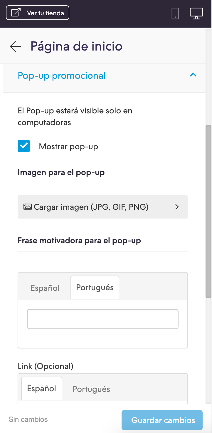
En el archivo config/settings.txt vamos a agregar el checkbox para poder activar o desactivar el popup, así como los campos para colocar un texto, un link y subir una imagen.
collapse
        title = Pop-up promocional
    checkbox
        name = home_promotional_popup
        description = Mostrar pop-up
    subtitle
        subtitle = Imagen para el pop-up
    image
        original = home_popup_image.jpg
        title = Cargar imagen (JPG, GIF, PNG)
    subtitle
        subtitle = Frase motivadora para el pop-up
    i18n_input
        name = home_popup_txt
    i18n_input
        name = home_popup_url
        description = Link (Opcional)
    subtitle
        subtitle = Newsletter
    checkbox
        name = home_news_box
        description = Permitir que tus clientes se registren para recibir novedades desde el pop-up (Opcional)
Traducciones
En este paso agregamos los textos para las traducciones en el archivo config/translations.txt
--- --- Home Popup

es "Pop-up promocional"
pt "Popup promocional"
es_mx "Pop-up promocional"

es "Mostrar Pop-up"
pt "Mostrar popup"
es_mx "Mostrar Pop-up"

es "Permitir que tus clientes se registren para recibir novedades desde el pop-up (Opcional)"
pt "Permitir que seus clientes se inscrevam na newsletter (Opcional)"
es_mx "Permitir que tus clientes se registren para recibir novedades desde el pop-up (Opcional)"

es "Imagen para el pop-up"
pt "Imagem para popup"
es_mx "Imagen para el pop-up"

es "Frase motivadora para el pop-up"
pt "Frase motivadora para o pop-up"
es_mx "Frase motivadora del pop-up"
Activación
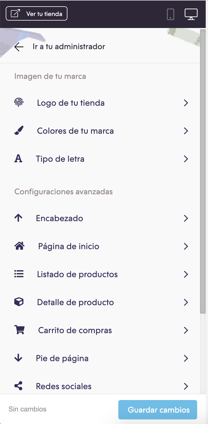
Por último podés activar el popup desde el Administrador nube, en la sección de Personalizar tu diseño actual dentro de las Página de inicio:
Observaciones
Una vez que se muestra el popup, el mismo ya no se mostrará nuevamente hasta que pasen 15 días, para verlo siempre podés entrar con el navegador a una ventana en modo incógnito.